Go and CHooooose! From today, October 14 all the way to October... 28th?
EDIT: Also, post your choice and why!
EDIT: Again, this is a DESIGN contest primarily! So choose the best design!
ART CONTEST
last edited by
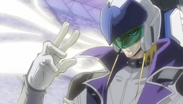
Leon votes for Lunar. He enjoys the syringe-of-death finger.
He also likes the overall bishie-ness for some odd reason.
He also likes the overall bishie-ness for some odd reason.
last edited by
I voted for all of them because I'm an asshole and am of opinion that, after speaking with DNR about his future ideas with the Navi, none of them really fit him.
last edited by
Sadly, one's art can never fit another's design conception. :'D
Still, as far as on the basis of Navis goes, I went with 8ball's. Tough pick, though.
Still, as far as on the basis of Navis goes, I went with 8ball's. Tough pick, though.
last edited by
...Lunar's... Because in my opinion DNR needs hands... so that gets rid of Albel and 8ball... and for some reason a Bishie DNR seems entertaining.
last edited by
I AM AN ASS.
XD
I voted for Albel AND EN. :3
EN's is just awesome.
And Albel's was the best art, in my opinion.
If I had to choose one?
EN.
XD
I voted for Albel AND EN. :3
EN's is just awesome.
And Albel's was the best art, in my opinion.
If I had to choose one?
EN.
last edited by
Ergh, mine is just embarrassing. XD
I vote for Shur's. Because come on, who doesn't want to see that?
I vote for Shur's. Because come on, who doesn't want to see that?
last edited by
I vote for lunar, I think she's got a cleaner design...
plus I can make fun of his bishiness...
plus I can make fun of his bishiness...
last edited by
As much "SHOOP DA WOOP LULZ" EN has, I still have a "Bishie DNR FTW!" overload.
Sorry mom, I voted for Lunar. :'D
Sorry mom, I voted for Lunar. :'D
last edited by
Quote (Zolem)
How does 'Shoop da woop' beat out my picture in votes?
Because it has epic and lulz, a deadly combination.
last edited by
I chose LunarLion's Submission due to the following:
1)The feel of the design was very detailed and warm in personality. A sort of orderly and distinctly genuine feel to the work, that's one of the things that really got me about this work because it had very definite and consistent nature to it.
2)All around the picture was just really really clean and crisp, it had a sort of polished and certain attribute to how it was laid, as though the artist had a distinct path they wished to take and made a point of for the most part sticking to this original path with acute awareness to what was being done with the work.
3)The syringe in hand is a VERY nice touch! I really like how its being held to, a sort of, "I could kill you just by flicking this into your arm and drawing out all the blood in your system, and I'd do it with grace and elegance to."
4)The overall essence of the picture is one of grace and elegence as commented earlier, a sort of, "I could kill you without even trying" vibe is emmited from it in my mind.
5)The EYES!!! >.>!!! I have a thing for well done eye's, and this artist truly did a wonder with them! I just really like the style of it
6)The stylization of the lance was well done and the navi emblem is of really intriguing properties in proportion to the rest of the character.
7)Lighting effects on this one were really amazing to! I just loved this work!!!
(A strong second for me was 8ballhead and Albel's submissions, It came down to those free and I just had to choose one of em...)


