Art fart time!
these are some drawings I doodled at work while on break/before shift...
and by doodled I mean tried, and by break/before shift I mean over several work days. anyways...
Too bigIf you've modded Void, this is a picture of "deadwood", a chip combo I do. since I rp chips as summoning monsters, this is 2 at the same time, an acid spewing tree dragon made of wood. No that doesn't work well...

This is nik'tik, a creature I made up when I was bored while at work. It's supposed to be an embodiment of chaos, and I'm tempted to write him up completely. it's such a cute dragon... monster... thing...
too bigThis was supposed to be a picture of Void, Imp, meeleman, and meelefish at the bar(drunk of course) for new years, but considering I came up with the idea 3 hours before the new year, it wasn't completed...
maybe next year...
Also, I got bored and doodled the most evil combinations ever, a metool that when it goes into it's "helmet" and gets hit it bounces around the area, and a koopa who can't be jumped on or burned because of it's "shell"...
apparently the navis/prog/SP weren't the only things that got wasted...

When I discovered a pic of sora's "net-sona" I wanted to try and draw this...
..go me?
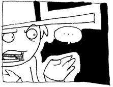
too bigand finally, Redaka the self proclaimed blazing warrior. He's on of the navis for my subplot. he's a fool hardy idiot how charges into battle crying his name as a... battle... cry...
anyways, his name is a bit of a joke. when I made him I knew this wasn't the fastest processor on the net, so his name is a combination of RED(for his hair/fire element), and BAKA(the japanise word for idiot). Also, I've never heard of "god of war" WTF is that...


