So yeah, some of the guys said I ought to make a thread, and I don't get to show off my art any other way so why not?
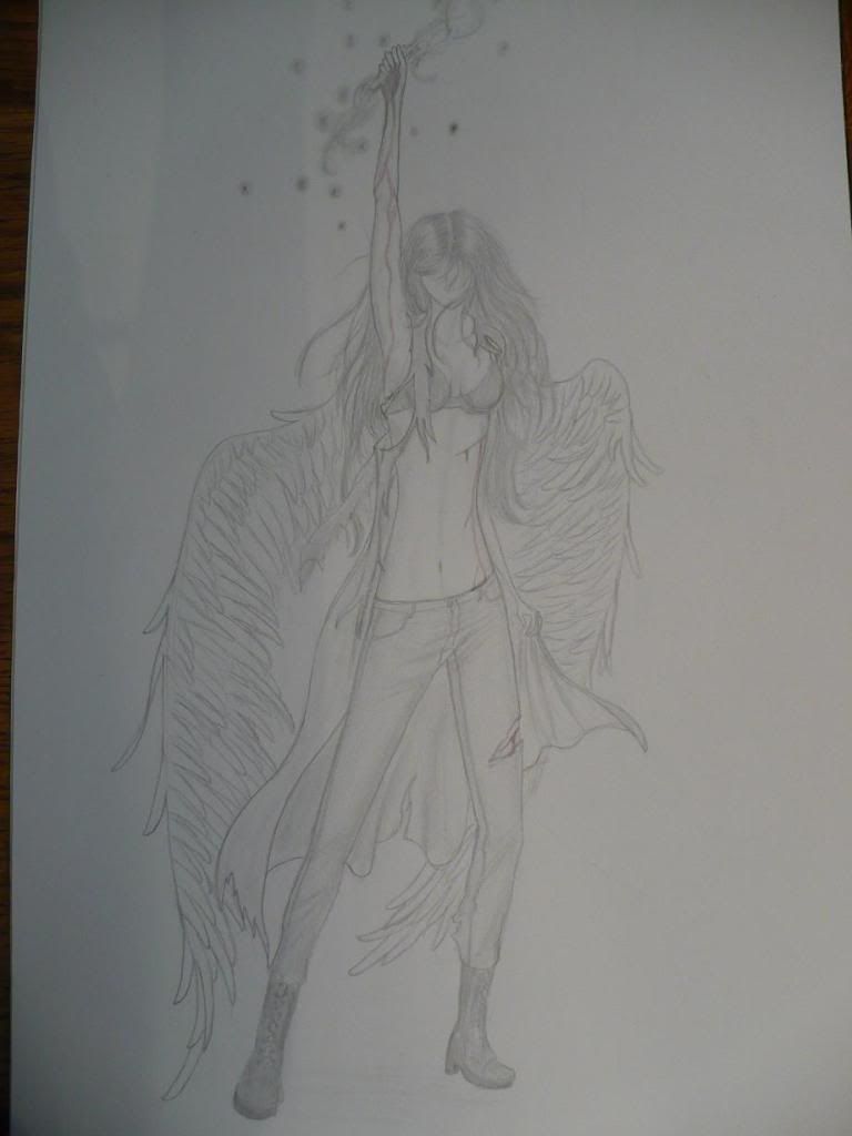
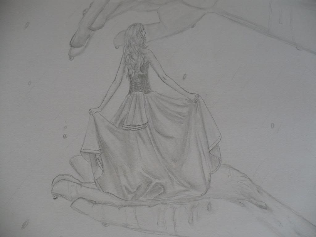
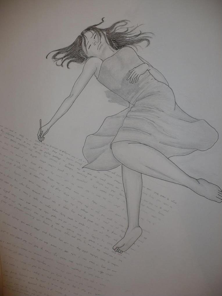
Anyway, here are some sketches I did a long time ago. The originals don't exist anymore since they were lost in the house fire, but they were saved on Photobucket at least.
http://i290.photobucket.com/albums/ll256/S...uly_2009039.jpg
http://i290.photobucket.com/albums/ll256/S...luv/Aug1209.jpg
http://i290.photobucket.com/albums/ll256/S...uly_2009001.jpg
http://i290.photobucket.com/albums/ll256/S...now_2009155.jpg
http://i290.photobucket.com/albums/ll256/S...now_2009128.jpg
http://i290.photobucket.com/albums/ll256/S...now_2009118.jpg
And here, when I ever get my profile up, are the two RP characters I have planned:
http://i290.photobucket.com/albums/ll256/S...uv/scan0001.jpg
(This'll be updated and more visible when I post the actual profile)
And there you have it. I welcome constructive critizism, and I do take requests as long as they're sent to me via a board PM.
Storyluv's Sketching
last edited by
Some proportions and details need work, you can ask others since I'm not exactly an expert on this. (Longtorso is long though) You draw really nice backgrounds, though, and I really dig the shading.
last edited by
Wow. That is some nice work. Its pretty cool how many awesome artists are on this site. I don't count myself among those awesome artists, obviously.
last edited by
These are some pretty nice pieces overall. The proportions do need a bit of work, as stated by Fera. Foreshortening also could be touched on a bit more, both are very challenging subjects to grasp, let alone master. As far as proportions go, hand size, feet size, and torso length are the biggest issues.
One suggestion I would like to make to you personally is to work on your line of action. Several of your characters are on the vertical with their posing, and that's boring to look at piece after piece. If you plan out your line of action a bit more, you'll have some seriously stunning pieces.
The shading you have used is great as well, I want to compliment you on that, but I think you could push it more than just what you have. Grab some different pencils, 2B-6B and put some good darks in there, and then grab a piece of white charcoal and put some really nice highlights and lights in the images.
Overall, very nice work and I can't wait to see more!
last edited by
Here's a couple more I particuarly like. The shading wasn't scanned very well on this one, but hopefully Syriene will find it a bit more action-filled ^.^
http://i290.photobucket.com/albums/ll256/S...uv/scan0003.jpg
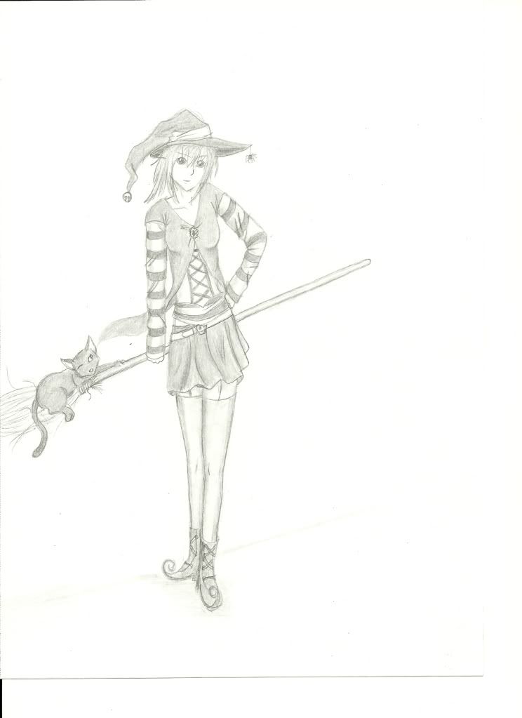
And it's that time of year, so I'm starting to get into the Halloween theme of my art:
http://i290.photobucket.com/albums/ll256/S.../scan0004-1.jpg
http://i290.photobucket.com/albums/ll256/S...uv/scan0003.jpg
And it's that time of year, so I'm starting to get into the Halloween theme of my art:
http://i290.photobucket.com/albums/ll256/S.../scan0004-1.jpg
last edited by
Some constructive criticism (HOLY CRAP I CAN DO THAT? WHAAAT)
Pic1: Right buttcheek looks like it's... sagging? :U Also right ring finger looks long, and right arm looks too stick-ish. Love dem claws though. Legs look long to me but maybe that's because I don't like long legs. :I Other than that, excellent post, I can't do action stuff very well. ;~;
Pic2: Heehee, there's a spider on her hat. And OH GOD THOSE LEGS SO LEGGY BV
last edited by
Those are pretty good, I really enjoy the first one. The proportions are a bit off and the body structure is a little wacky, but overall its good. The pose is dynamic and even if you didn't mean too you followed a classical comic book ideal. The evil character is coming from the right, and the hero is coming from the left. That's a power struggle setup. Because of the way we read the ee naturally moves from left to right. So a character that is moving in the right direction on the picture plane is instantly, in our minds, thought to be abrasive at the very least. The posing in showing which one of the two is in power is also great. Next thing I would suggest you work on is making your legs a bit shorter for one lol. From the top of the pelvis, to the bottom of the feet, is the same length as the head to the top of the pelvis. So the legs are supposed to be half of the height of the character, and the thighs and the caffs are both about equal lengths. On both of you drawings you favor longer thighs. Also, the hand is about the size of the face on most characters. Clearly these rules can be broken once you learn proper characterization and form. You're well on your way to learning those no worry.
In the first one I LOVE the line of action you have going on. The thing that needs the most work here is foreshortening, which is a TOTAL PAIN!!! I hate doing it, but if you get it right it makes your drawings look awesome sauce! And since the only thing defining the space is the characters, foreshortening is needed to make the space seem 3D.
The second one has good form and folds, although the same problems from before of tiny hands and long legs. This drawing poses a new problem though. Where are her hips? O.o. And where does her ribcage end? Seems like silly questions to be asking, but Defining these two area's give vast amounts of definition to your characters torso. Judging by her proportions you wanted this character to be a young adult, or at least a teenager. But with the structure of her torso, she looks like a little kid. I can give a deeper explanation on these if you want. Also, I still think you could push the darks more. Take a bed sheet, lay it over a chair so there are lots of folds, and turn a single light on it. Look at the darks and you will see what I mean.
Over all the pieces are very good. I liked that you used great line of action on the first one, and on the second the characters setup and costume was great. The things that I commented on, such as proportion, foreshortening, and lighting, are all very advanced drawing ideas, and you should be proud that I brought them up, means you're doing excellent.